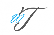
Woke up this morning with an image in my mind. An image of a logo for this site. 2 letters appeared, W and T.
At 1st I thought, its just the initials of my name, simple. But soon I realize, the image in my mind is not just 2 letters. There is something about the placing of the letters…
Ideas come to me in the wee hours of the morning, that is when i am my most creative.
Looking at the placing of the letters is in my mind, I finally got what my mind is trying to tell me… It’s not William Tan.
W is in blue and T is in grey. W stands for wings and blue is a color of freedom. T is Torphaine, which is me. Grey being my stoic, solemn self. Torphaine has wings of freedom to fly and to express.
Is that it? that’s not. W is also Wendy, my mother’s name. Wendy is within me, I will always be 50% my mum. Why within me, her kidney is within me. Her kidney is my wings of freedom, freedom from the sufferings of dialysis and my gateway to possibilities, wings within me to help me fly.
I guess everyone has their own wings within us, most of us just don’t realize that its wings as it has been taken for granted.
The kidney gave me back health, something which many has taken for granted. Do not clip your own wings. We can only appreciate and cherish what we have when we acknowledge its existence.
